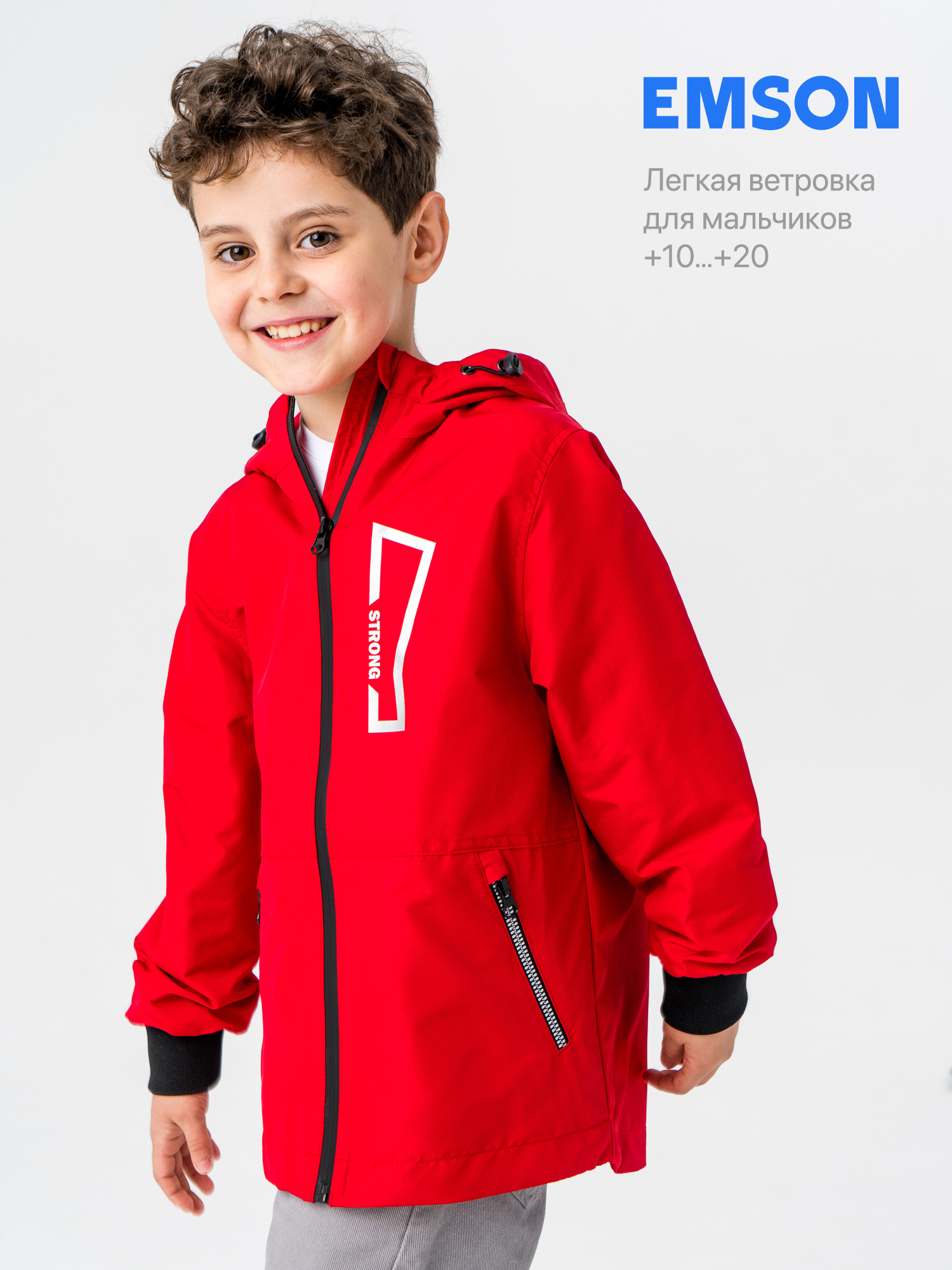
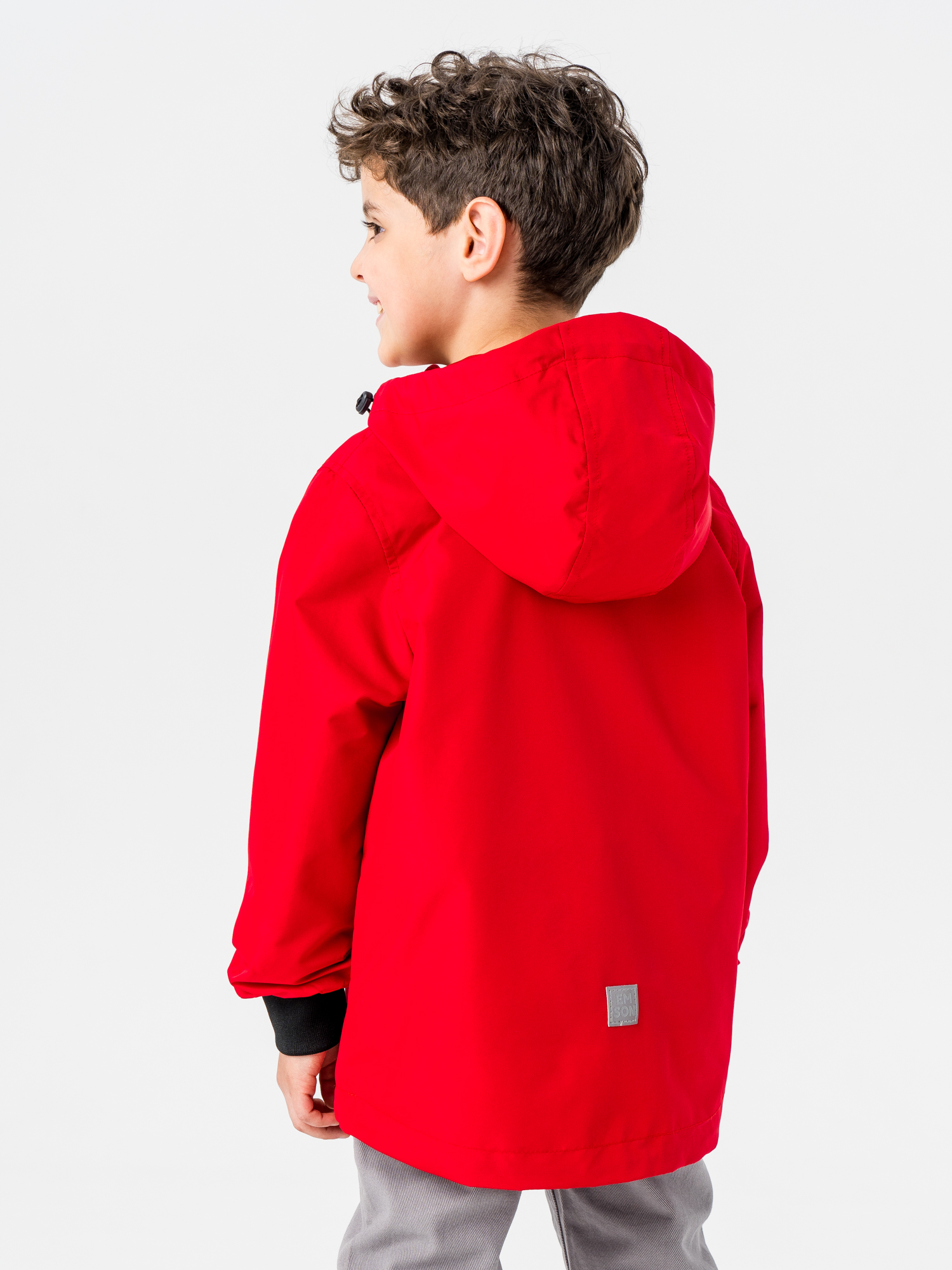
Perfect product photos
The ideal photocard is a visual story balancing between functionality and emotions, between dynamics and static, between general, medium and close—up.
Cover
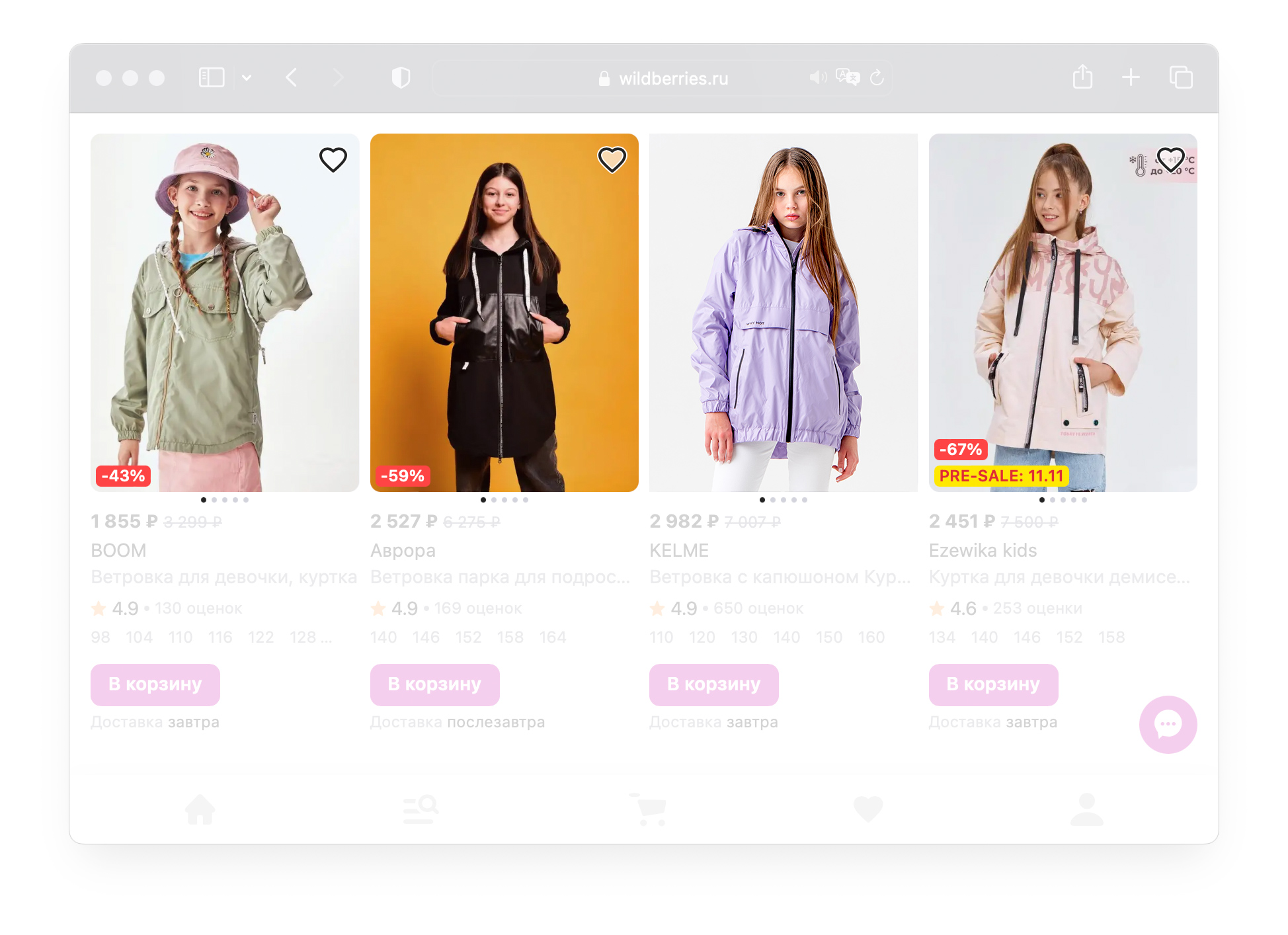
The first photo of the perfect card looks advantageous among competitors, conveys the emotion of the brand, and the product occupies the maximum area. The more examples in the context, the better. If the cover is not inferior to competitors in trimming, color, light — good.
Montage
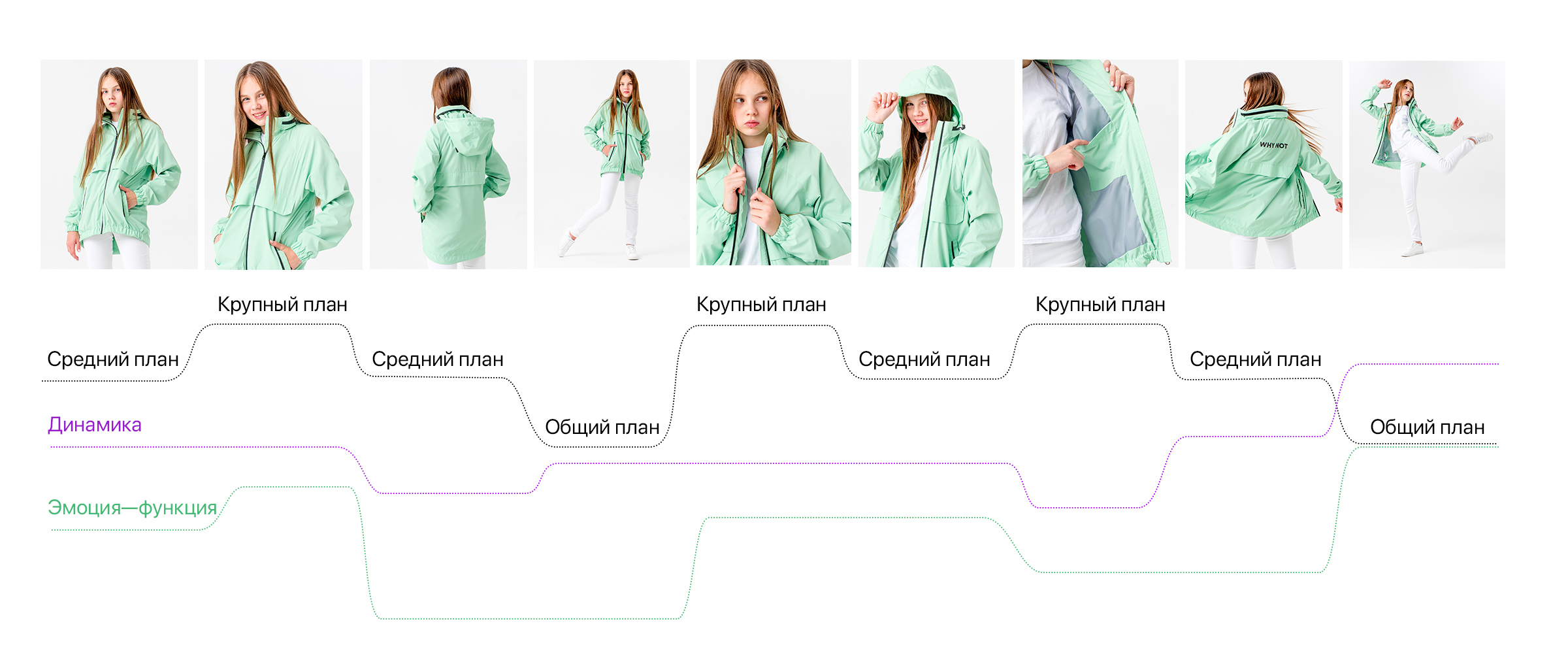
A card is a story where each subsequent frame differs from the previous one in accordance with certain rules. You can zoom in and out, show details and other functions, add more dynamics and emotions.
Below is an example where the plans are replaced by a wave, and the whole card consists of three sections — general view, details, dynamics. The easiest way to imagine that a photo card is a storyboard for a video.
Infographics
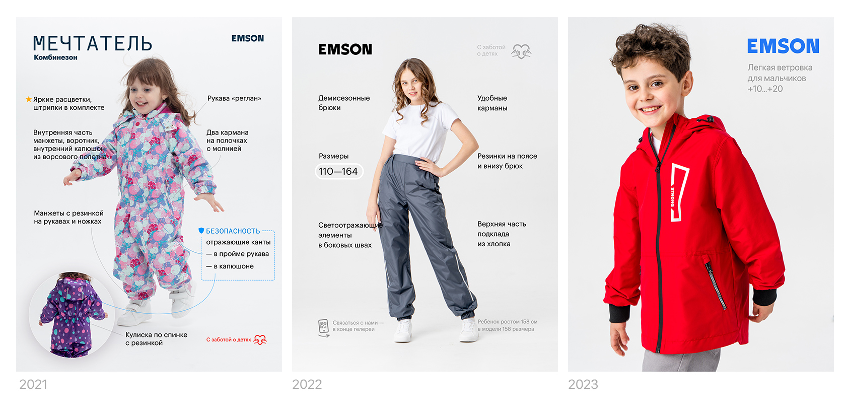
There is no excess of infographics in an ideal card. For 2023, the markets are full of bright, flashy infographics. And it becomes a cheap trick. In order to stand out among such cards, and not distract from the product, it is better to make infographics minimal and calm: without flashy colors, bright dies and large font sizes. Let the product speak for itself.
In an ideal card, you can combine infographics with a photo, maximizing the benefits: for example, show the dimensional grid and the product itself in one frame.

Evgeniy, what have you done!
Hi! My name is Evgeniy Agasyants. I am a designer of interfaces, logos, and everything that can be shown on the screen or printed on paper. Produced photo shoots.
In my free time I create fonts and develop a web font editing service typlr.app
