Manfas Beer Labels
Manfas Brewery is a small craft brewery.
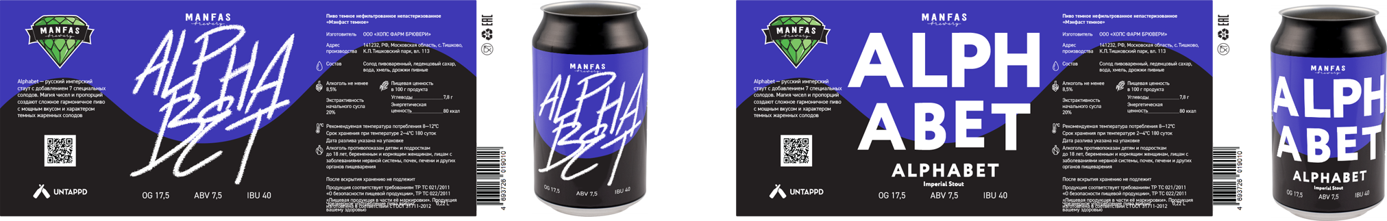
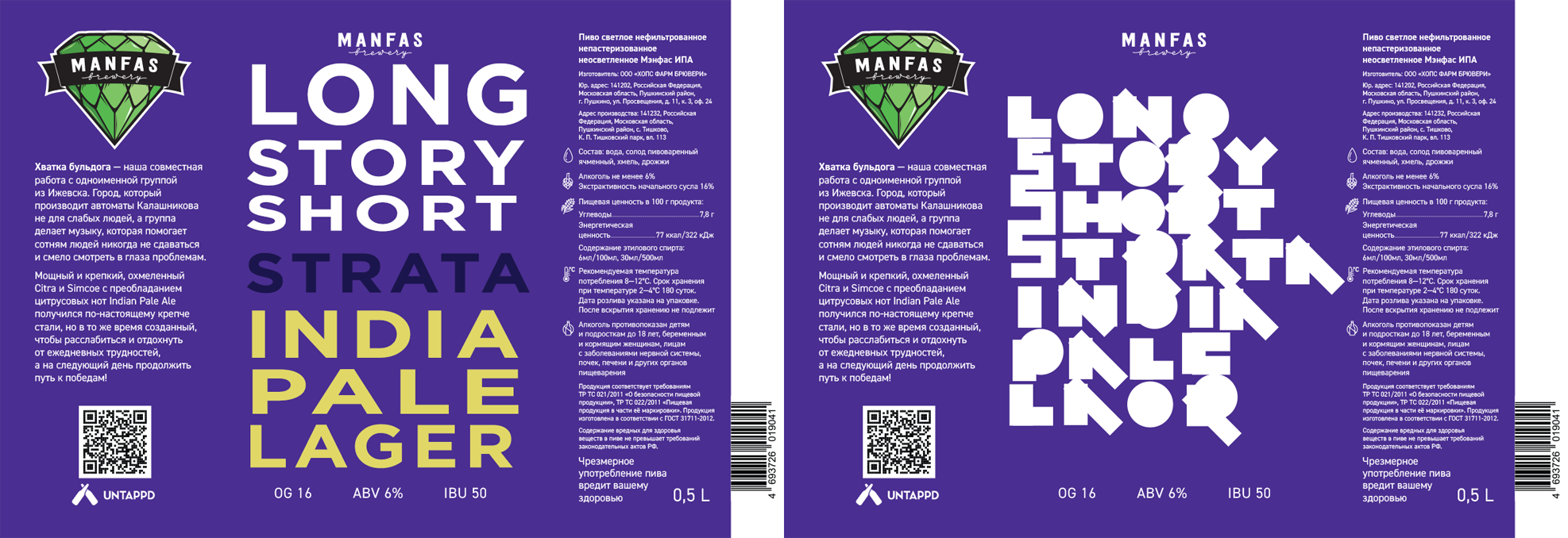
The templates with the description were turned over for the labels. Everything is in its place on each label, on the left there is a description and a logo, on the right there is output information. There is an illustration in the center.

Together with a universal template, each label is complemented by its own unique illustration.
Alphabet
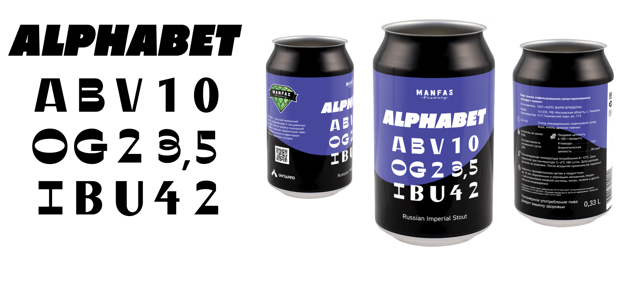
The alphabet is a vision check table in which the letters already look strange and unnatural.

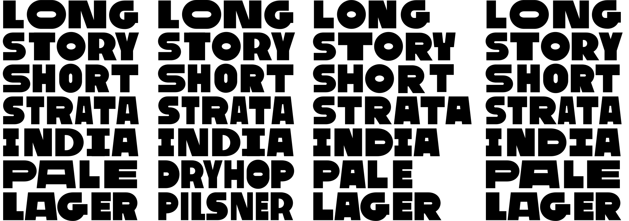
Long Story Short
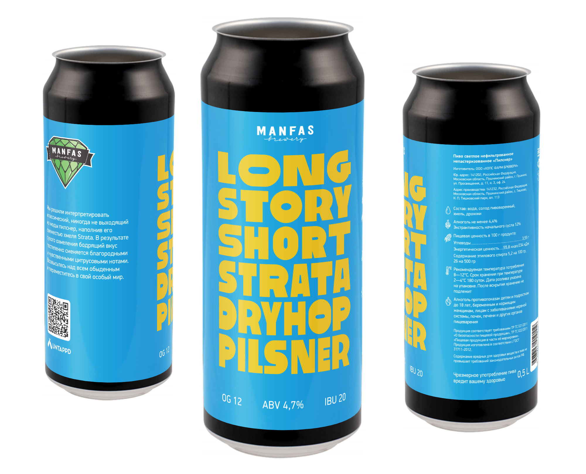
Long story short — in short, but the label does the opposite — throws a lot of words at the viewer.

In The Old Days


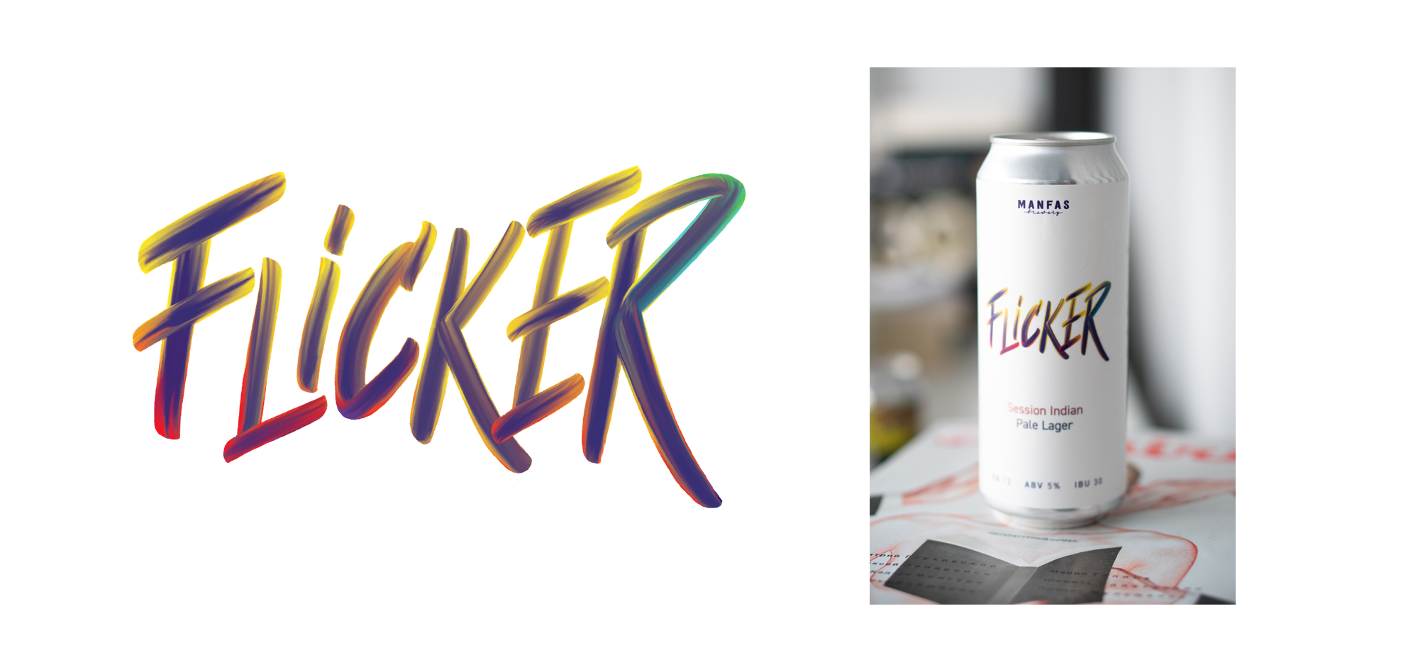
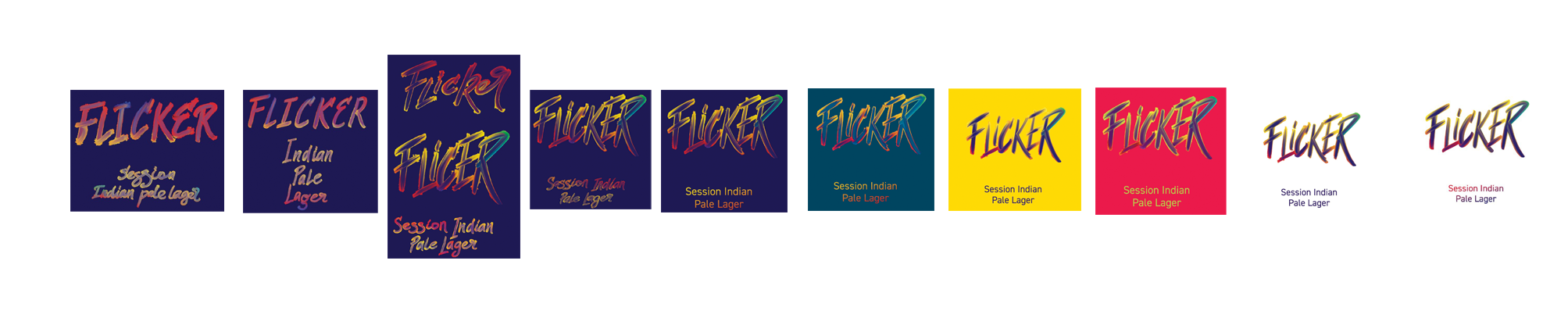
Flicker
The client writes, you had an lettering on Instagram, you want to do it in the same style, smeared bright letters.

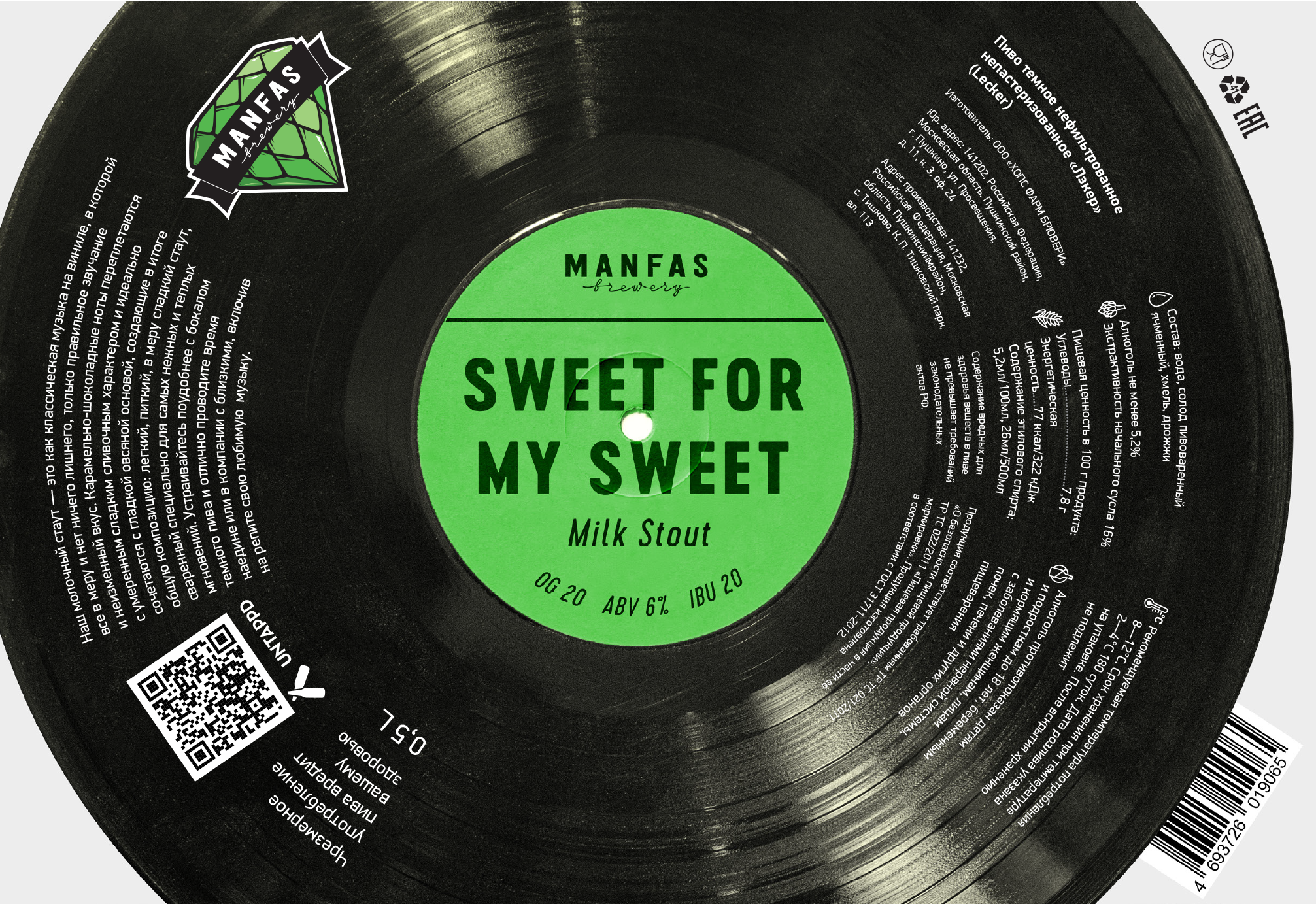
Sweets for my Sweet
The customer says that there is a milk stout, it is sweet, like the song Sweets for my Sweet.
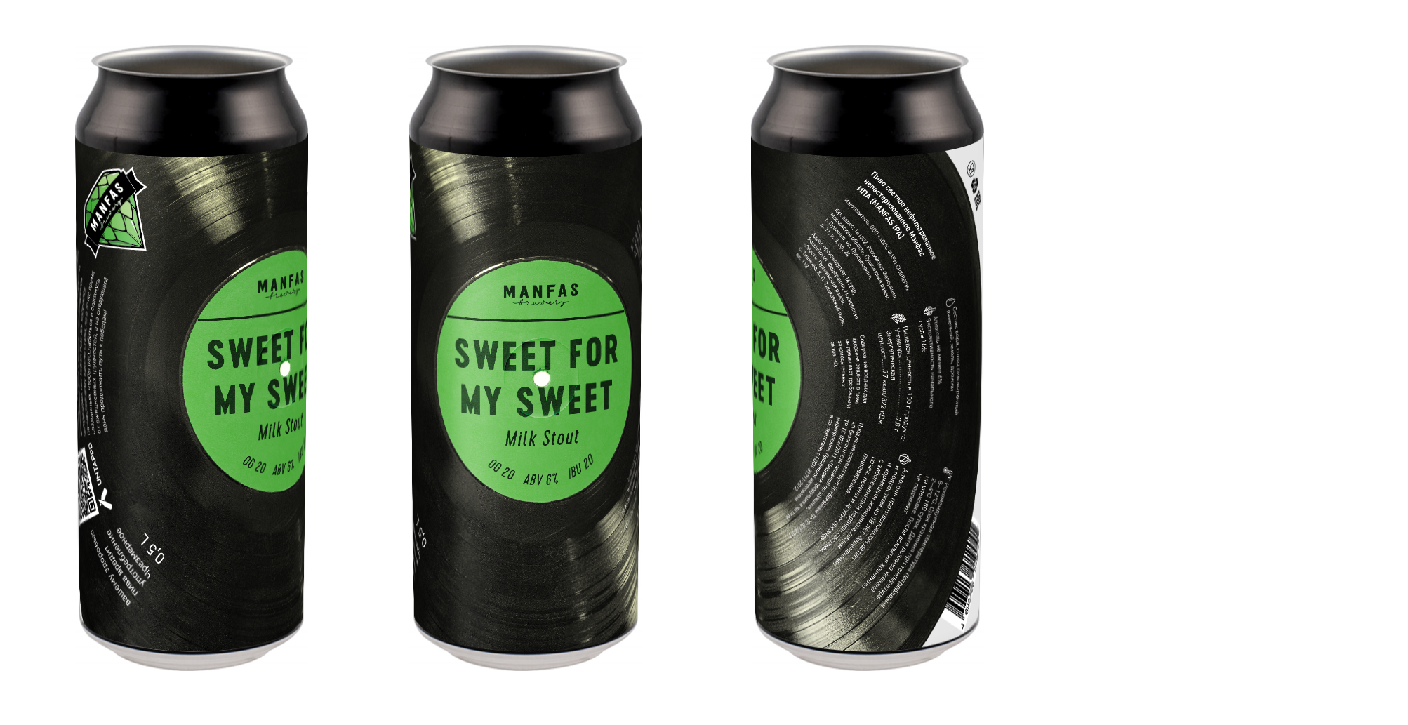
The idea of the record was from the very beginning. We delve into the topic and look at how old records are arranged.
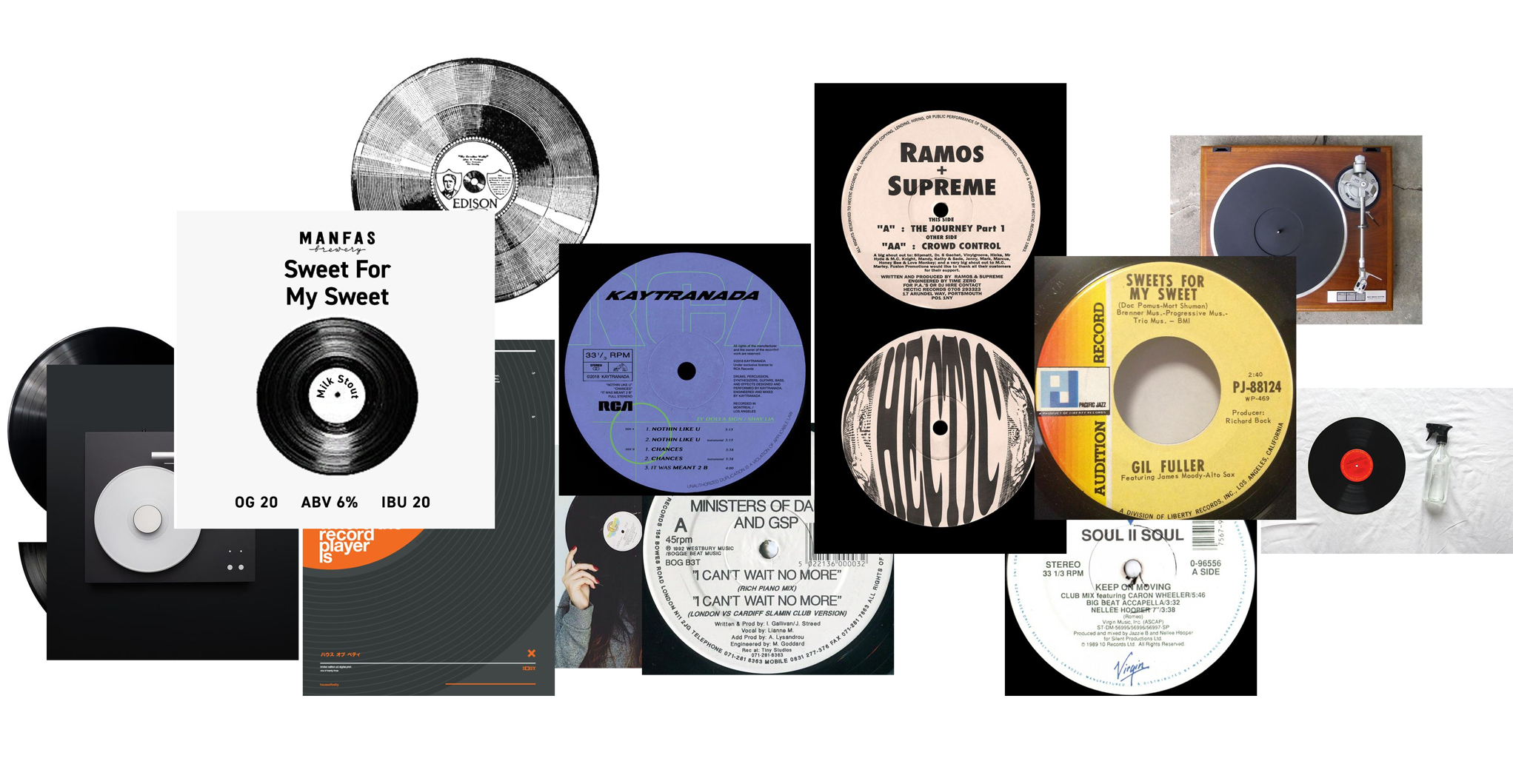
We find the record in a box with old things and take pictures of it. It immediately becomes clear that you need to place the plate on the entire area of the label. But it is unclear how to make up the text. We usually try, at angles, in the direction of the center.
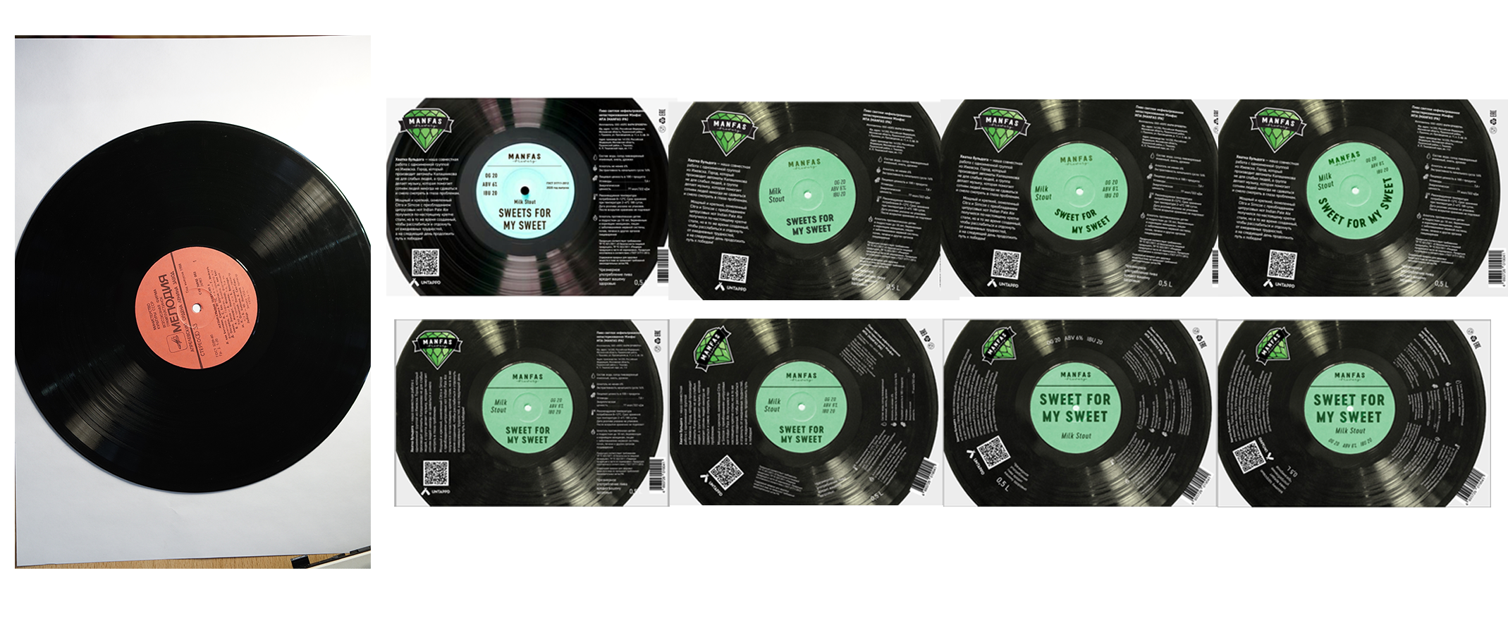
The text typed along the tracks of the record itself shows itself best.
Evgeniy, what have you done!
Hi! My name is Evgeniy Agasyants. I am a designer of interfaces, logos, and everything that can be shown on the screen or printed on paper. Produced photo shoots.
In my free time I create fonts and develop a web font editing service typlr.app
© 2023 Evgeniy Agasyants