Arena sports complex

The Arena Sports Complex is a commercial sports ground for training and competitions. In order for visitors not to get lost in the space of the complex, navigation elements were invented — signs and inscriptions, and image elements to create an atmosphere and enhance corporate identity.
Preparation
We communicate with the customer's team and find out that the previous navigation concept is not suitable. Along the way, we learn that there is already a description of routes divided into different audiences of visitors.

We take a bunch of photos and look into every corner, discussing ideas and details along the way. We find out that of the running elements of the first style, only the logo and the corporate pattern.
Idea
We do our homework. We look at everything that seems interesting or appropriate: sports, navigation elements, expressive typography, stickers and emojis — discussed with the client as an example of visual informal communication, expressive verbs. It turned out to be a huge mudboard.
We formulate the concept of the "Arena" language. Sharp, simple language — and as a result expressive typography with a dynamic angle. We make a long presentation and show it to the team.
With the exception of the language, the concept was well accepted, but it took clarification of the visual language and elaboration of use cases.
We are also making an approach to the projectile. It turned out to crystallize the idea into three components: form, typography, and language. We describe concerns, decorate the walls with large typography, and apply an approach to a poster with rules of conduct.

Prototype
We make the first sketches of the photo bindings. We assume that the key nodes will be decorated with large inscriptions, and the more detailed ones with curly plaques.
Включаем обычный офисный принтер, вооружаемся ножницами и скотчем, и делаем примерку. Где-то пробуем прямые таблички, где-то скошенные. Но самая важная проверка на прочность — большая надпись трибуна — важно понять, как надпись будет смотреться в живую.
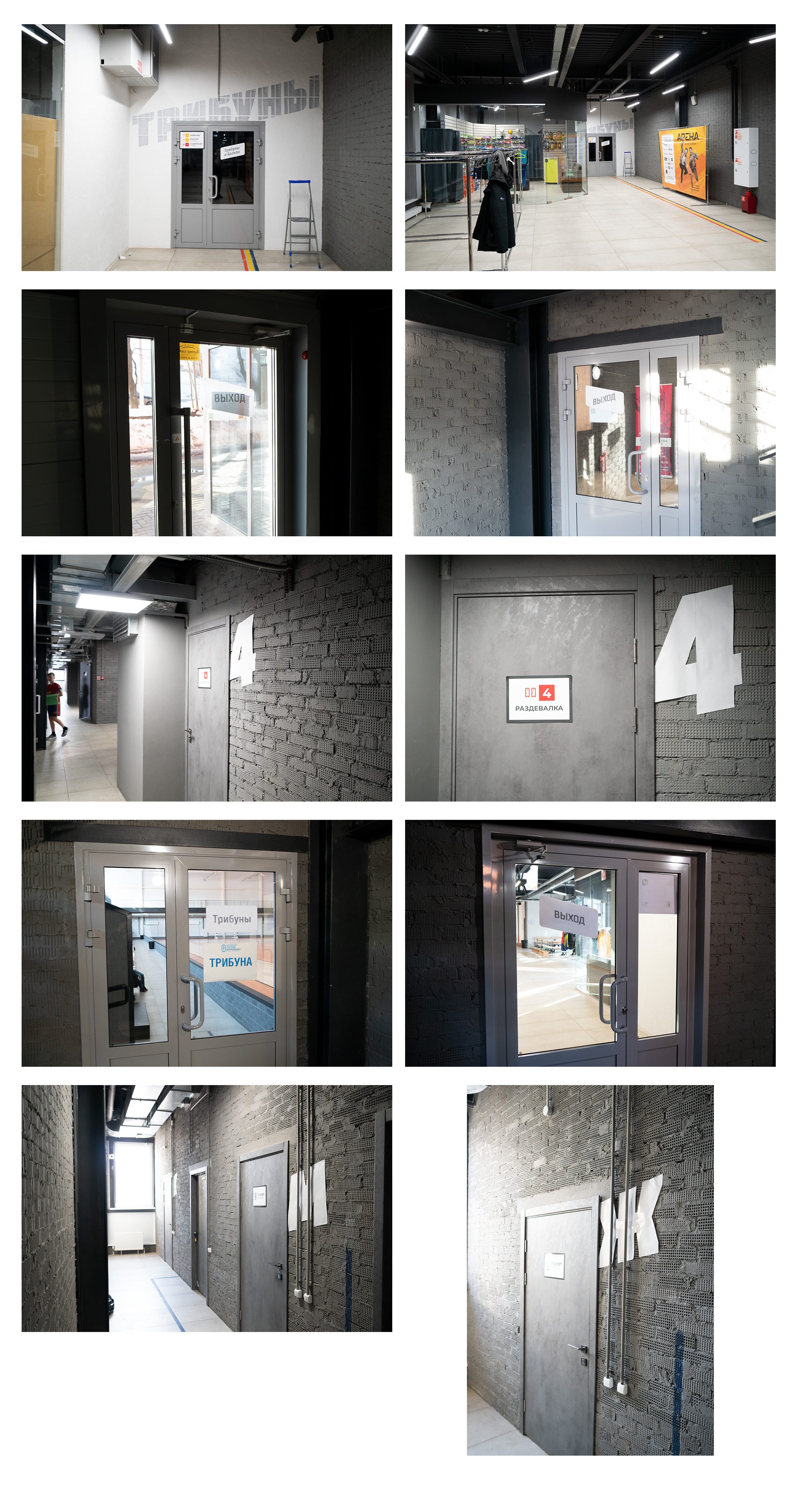
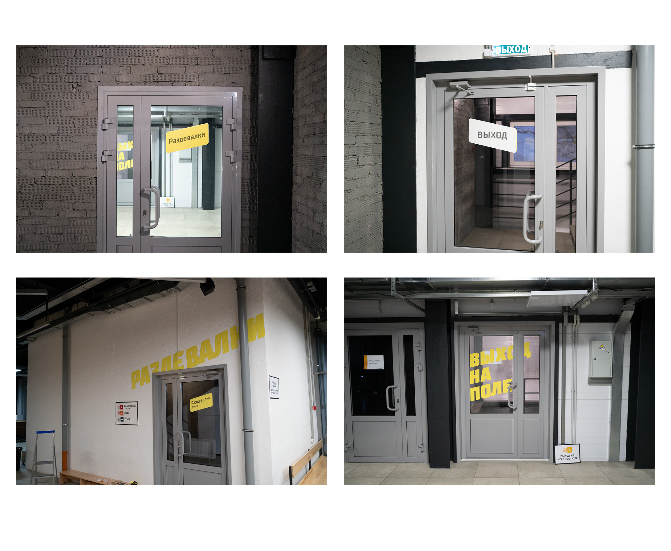
There is not enough color. We go to the store and buy colored office paper and make some colored fittings. We leave everything in its place so that we can collect feedback when we return.
Production
All prototypes have been tested. It remains for a small matter, we make instructions for painting, gluing and producing plates.

Almost all the signs are in place, the inscriptions are applied. You can do additional formats: chalk plaques, photo zones, cork boards. For everything, you need to visualize in the future size.
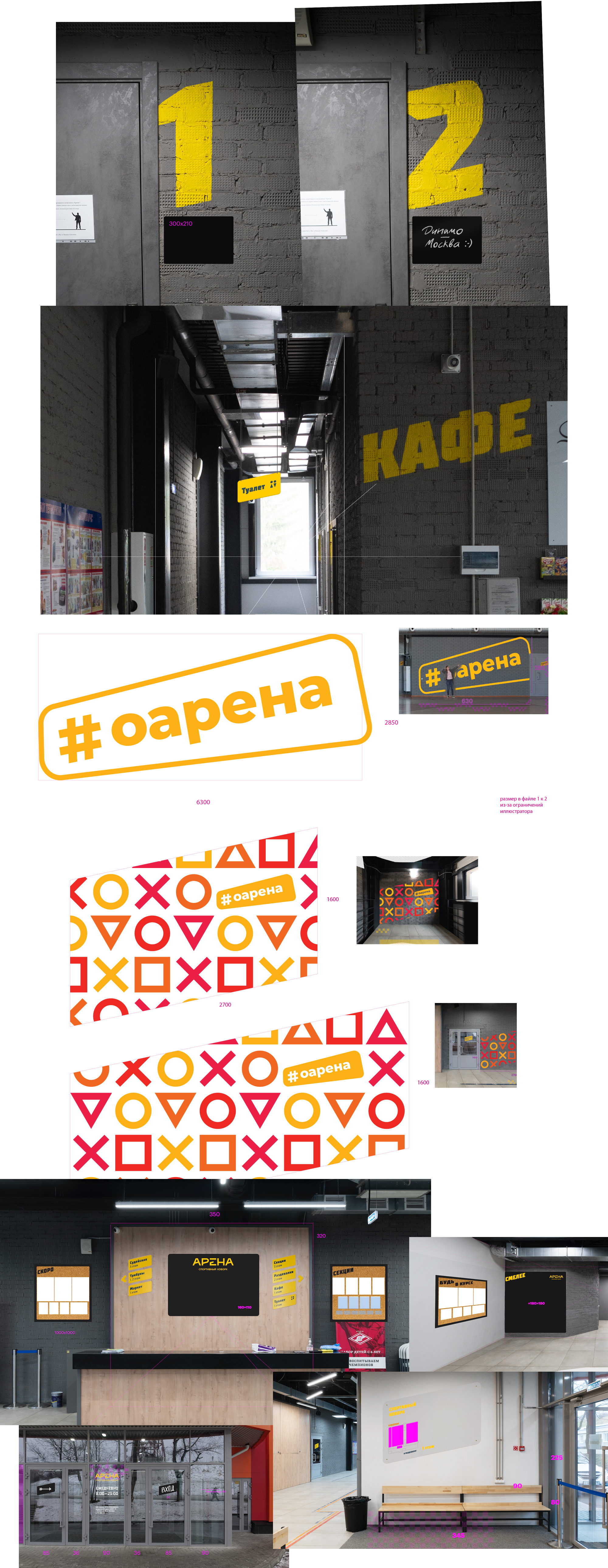
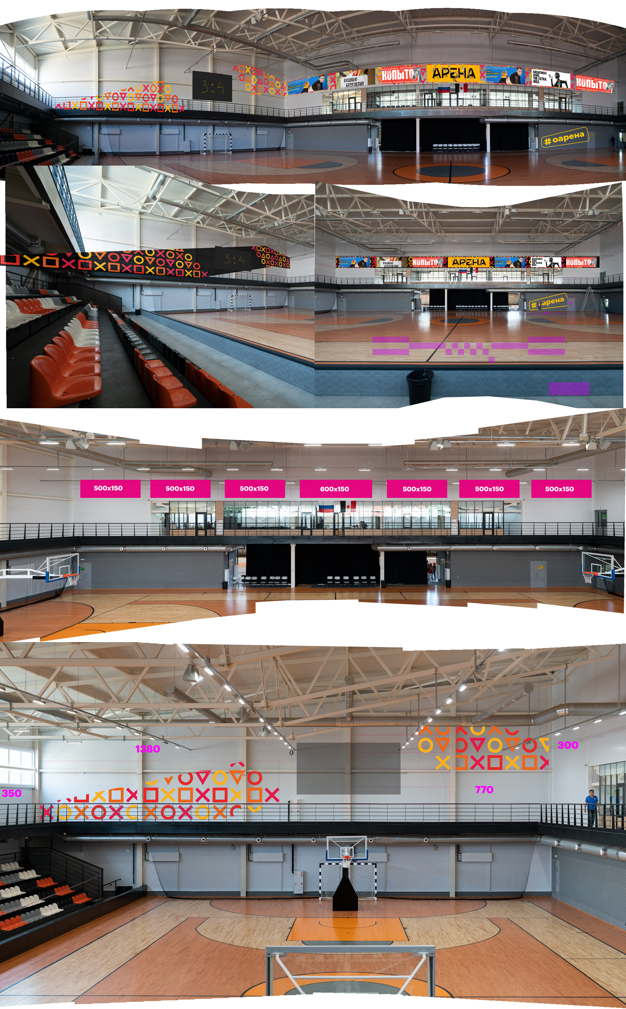
We go to the hall and design a corporate pattern and place advertising spaces.
We go outside and try on giant letters. We specifically abandon graphics in favor of typography.
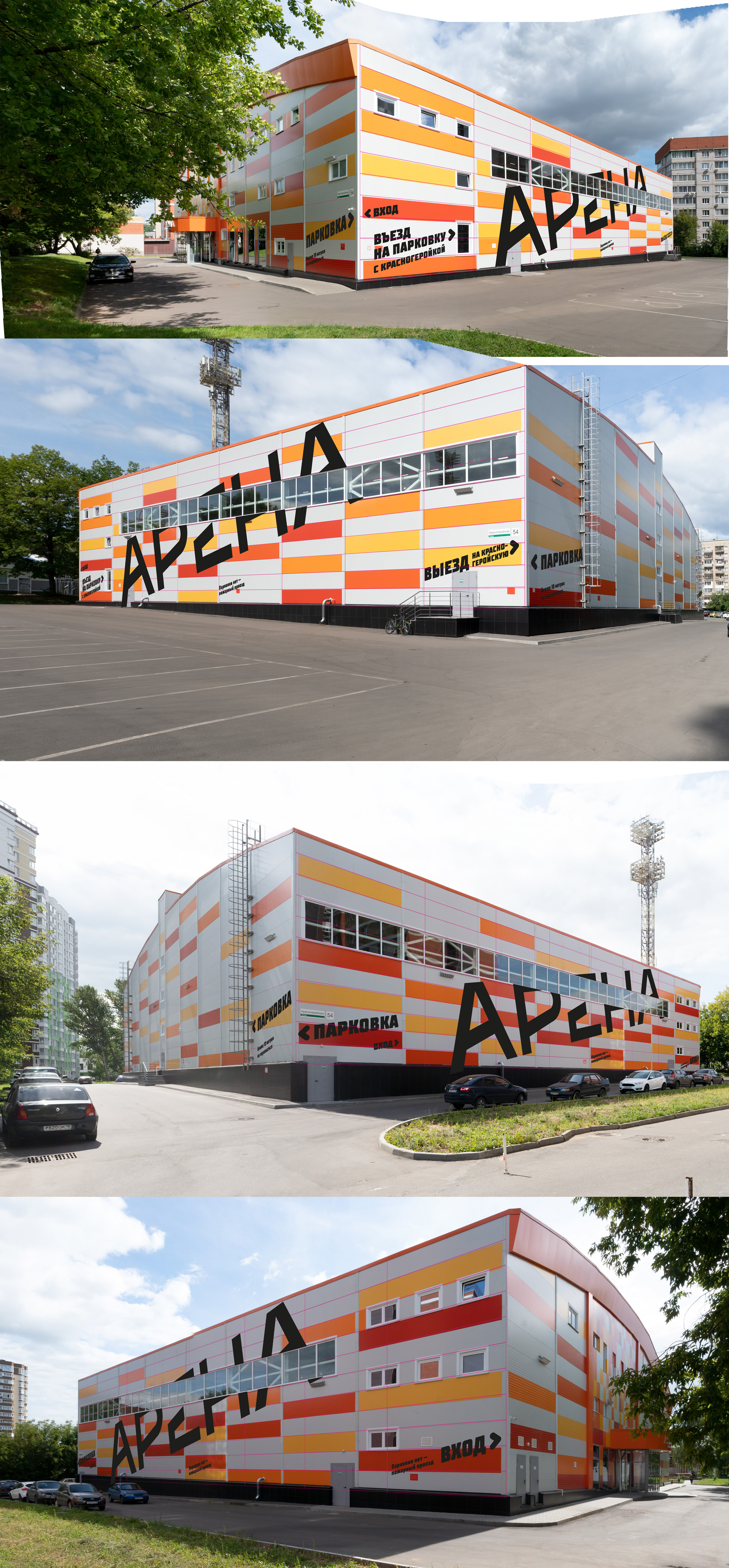
Unfortunately, the team refuses to implement such an idea in favor of budget savings.

Evgeniy, what have you done!
Hi! My name is Evgeniy Agasyants. I am a designer of interfaces, logos, and everything that can be shown on the screen or printed on paper. Produced photo shoots.
In my free time I create fonts and develop a web font editing service typlr.app
© 2023 Evgeniy Agasyants